PowerPoint Presentation Design Capabilities
Many of the PowerPoint design projects I've worked on have been confidential in nature, created under NDAs or for internal use only. So, while I’m unable to showcase the original client materials, the before-and-after examples featured here are representative of the type and quality of work I regularly produce. Each slide in this collection demonstrates my approach to visual storytelling, clarity, and brand alignment, offering a glimpse into how I transform content into polished, presentation-ready designs.
View my resume by clicking HERE.
Brand & Storytelling Case Study
I do not recommend viewing these slides on a mobile device: the captions get cut off and the formatting can appear jumbled.

This deck redesign began as a typical internal onboarding presentation: dense, text-heavy, and off-brand. The goal was to elevate the narrative and visuals to better reflect Lumeo’s identity and mission.

The original slides lacked cohesion, narrative flow, and brand consistency. My redesign focused on translating Lumeo’s purpose and personality into a memorable onboarding experience.
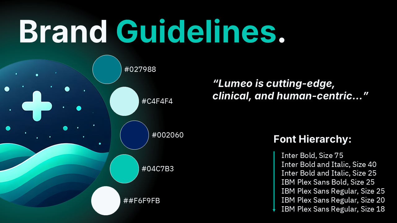
I began by referencing the client’s brand guidelines. The redesign intentionally centers Lumeo’s aesthetic: cutting-edge, trustworthy, modern, and compassionate.

This redesign uses whitespace, or in this case, black space, in addition to patient photography and a branded color overlay to create a bold and confident feel.
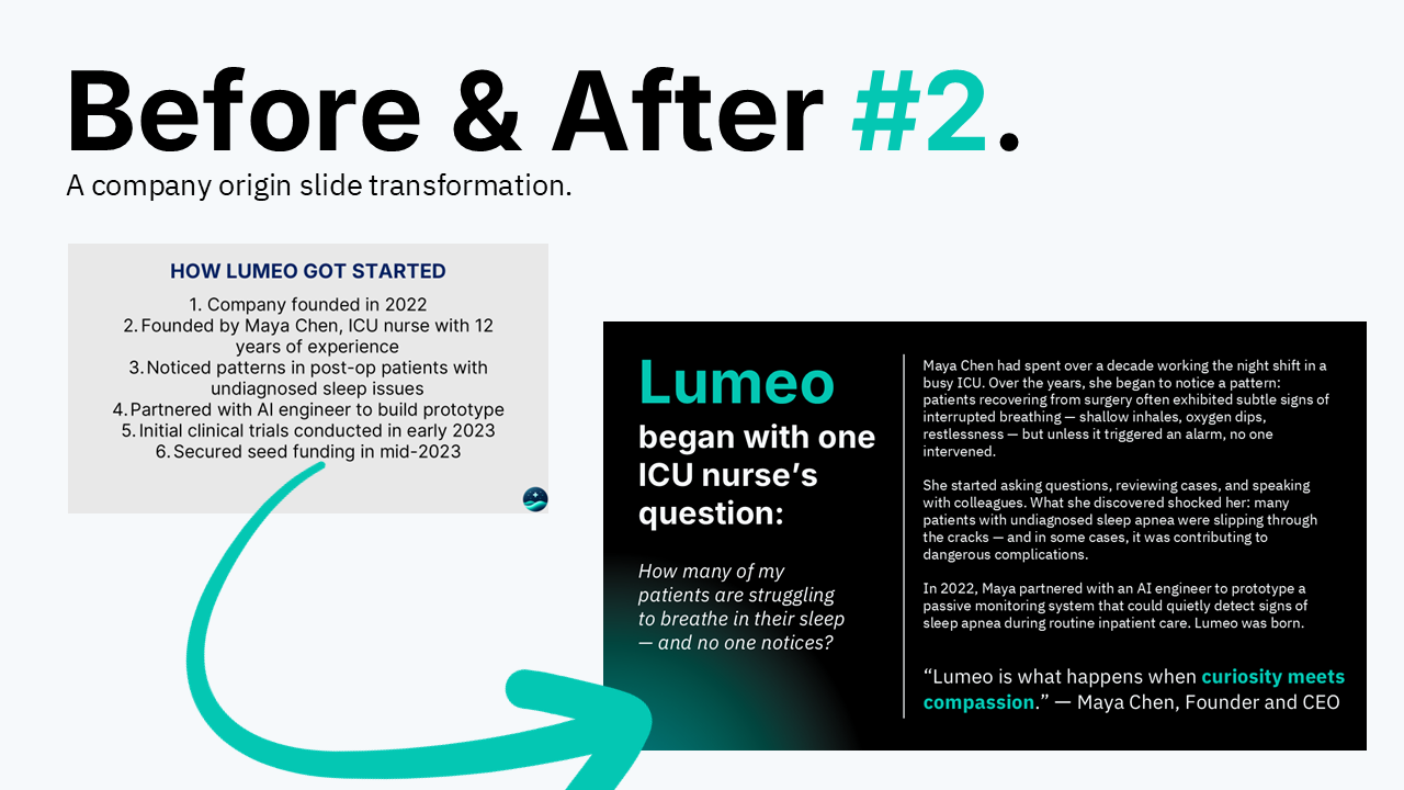
I redesigned the origin story as a narrative moment. The redesign brings truth to the forefront, turning a simple list into a compelling beginning.

To elevate Lumeo’s values, I used iconography and layout to give each value space and visual identity while maintaining brand clarity and message flow.

A clear narrative arc improves retention and engagement. This visual map shows how I restructured the presentation around a natural flow that welcomes new employees into the story.

Across every slide, I applied consistent brand elements such as typography, spacing, color, and tone. This collage showcases design range while maintaining total alignment with Lumeo’s identity.

The original onboarding deck was functional but uninspired, which is a common issue with internal presentations. I transformed it into a storytelling experience that mirrors Lumeo’s purpose and personality. Today, it can be used as a foundational tool to introduce new hires to the culture, mission, and momentum behind the brand.

This quick behind-the-scenes snapshot highlights the consistent design process I bring to every project: one that’s strategic, intentional, and rooted in empathy for the end user.
Instructional Design and Accessibility Showcase
Please note that the term “accessible” has many interpretations. If you’d like a more accessible presentation, let’s discuss what inclusivity means to you and your brand.

Opening slide introduces the project focus: creating educator-friendly PowerPoint templates that combine interactive features with strong accessibility standards. The design sets the tone with a professional, education-centered visual and clear, concise titling.

This slide highlights why strong presentation design is essential in the education sector.

This is my template design approach: modular layouts adaptable to various content, structures that are quick to update, and consistent visual branding to maintain a polished, professional look across all materials.
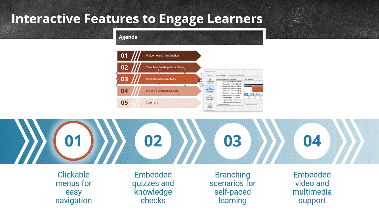
This first gif shows examples of interactive PowerPoint features that enhance learner engagement for overall richer instruction.

This sequence shows my accessibility-focused design methods, including high-contrast color schemes and readable typography, descriptive alt text for visuals, and logical slide sequencing to support smooth keyboard navigation. (Apologies for the low gif quality. Squarespace has file size upload limitations!)

In short: I create modular, learner-focused, and accessibility-compliant designs that adapt to varied use cases, engage diverse audiences, and ensure inclusive, barrier-free learning experiences.
Pitch and Data Design Demo
Please keep in mind that the animated slides shown here have been uploaded in GIF format. That is to say, the actual presentation quality is much higher, and the looping isn’t present.
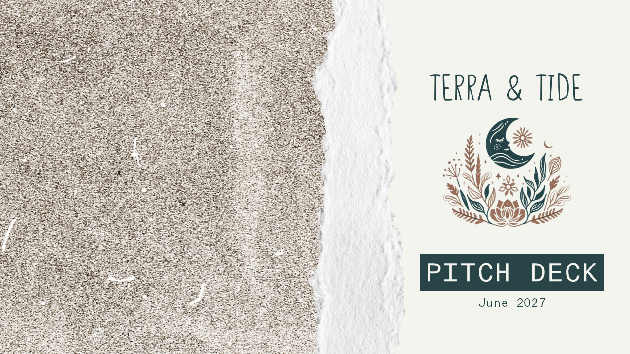
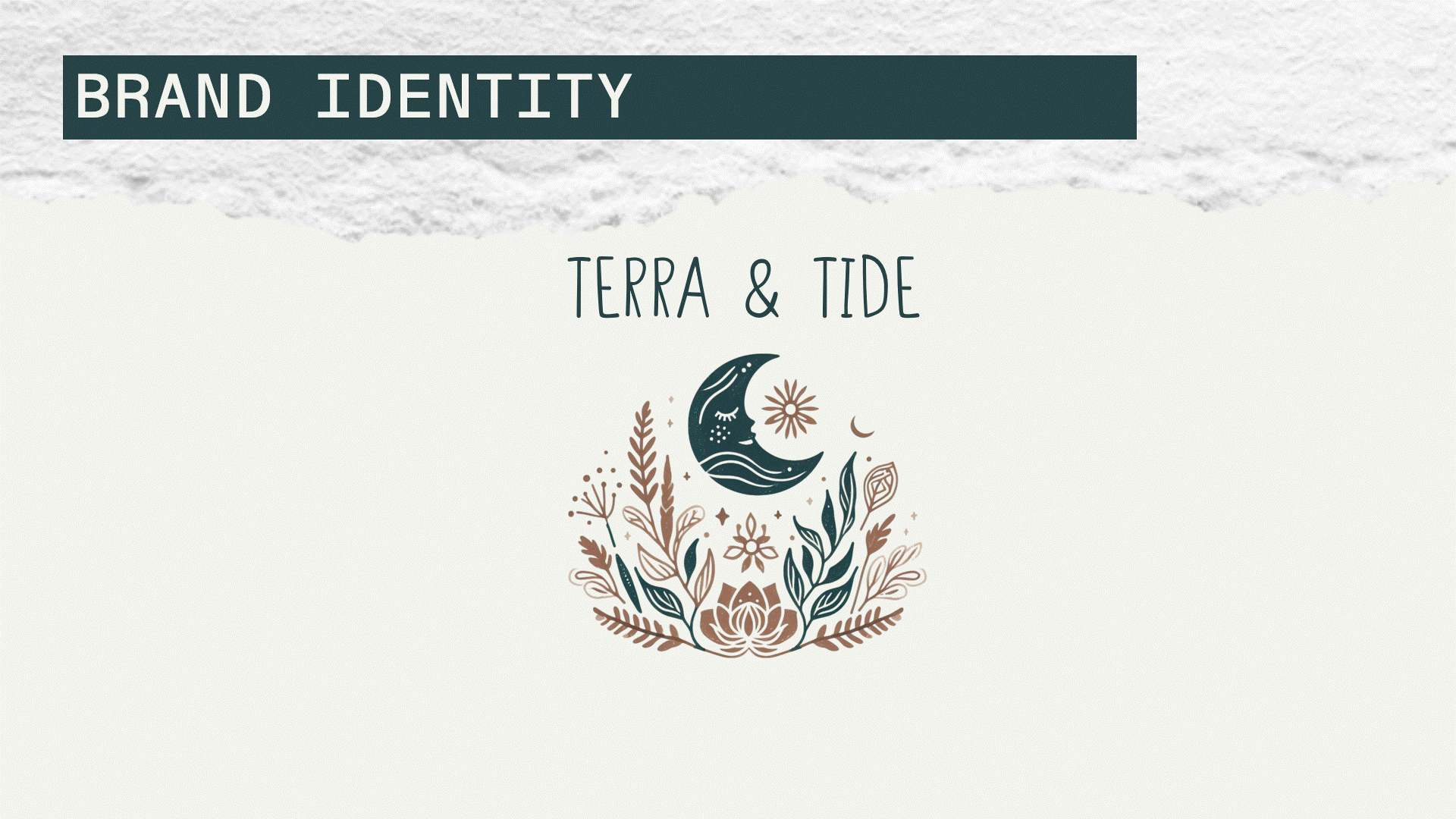
This clean, brand-forward title slide sets the tone for the deck. I introduced natural textures and minimalistic typography to reflect Terra & Tide’s identity: grounded, modern, and mission-led. Even at a glance, this slide signals design polish and clarity.
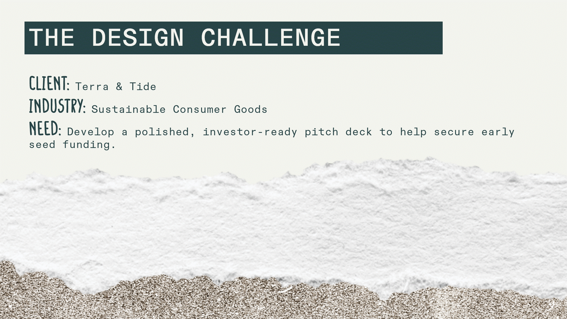
Before diving into the pitch content, I framed this project as a design case study. This slide outlines the original deck’s weaknesses: disjointed messaging, dense content, and visual inconsistency. This sets the stage for how I addressed them through narrative flow and brand cohesion.
Using a seamless morph transition, I split the traditional “problem/opportunity” slide into two layered storytelling moments. First, I ground the viewer in the global plastic crisis, then "pull back the tide" to reveal the market potential. This moment uses animation to reinforce flow while separating emotional urgency from business upside.

This slide demonstrates a creative way to visualize data: using torn pieces of paper to create a bar chart. This graphical representation is far more on-brand than a standard native PowerPoint graph.
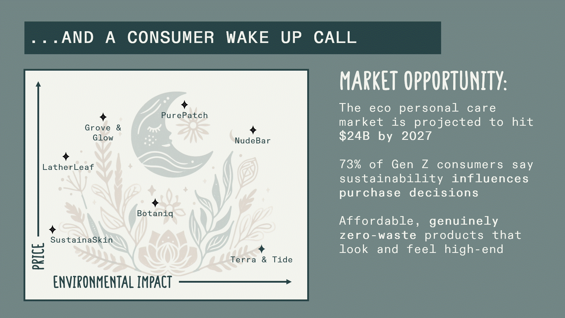
I created a custom positioning map to highlight Terra & Tide’s whitespace in the market, visually emphasizing how the brand stands apart in affordability and true sustainability. This slide reinforces strategic thinking while remaining clean and design-forward.

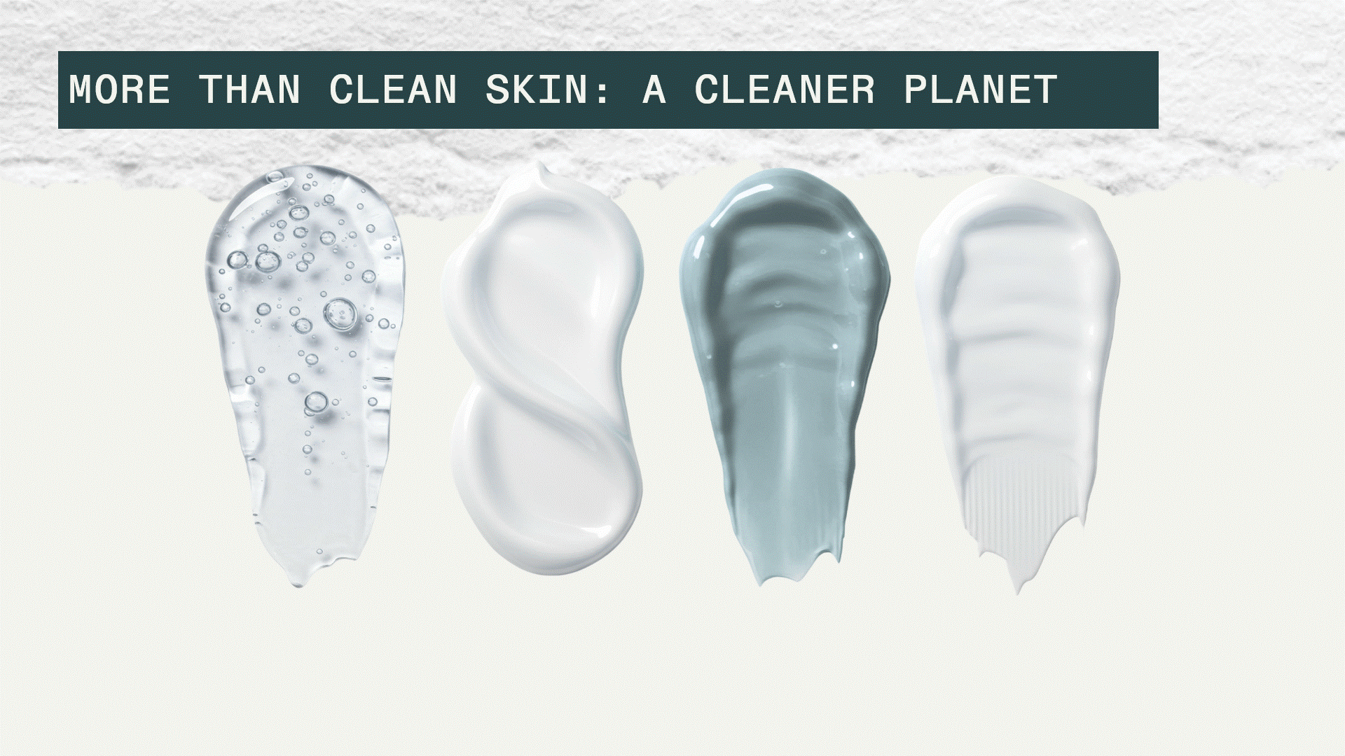
Rather than a technical breakdown, this slide presents the product solution as an elegant visual block: packaging callouts, brand values, and subscription benefits are grouped using soft layout techniques.

This slide helps to build credibility for the brand. I emphasized whitespace and various design hierarchies to ensure that each number supported the momentum of the pitch.
Here, I transformed non-financial impact data into a set of stat blocks. Subtle animation and spa-like tones reinforce the brand’s mission without overwhelming the layout. This slide balances logic with values: an important nuance in sustainability pitches.
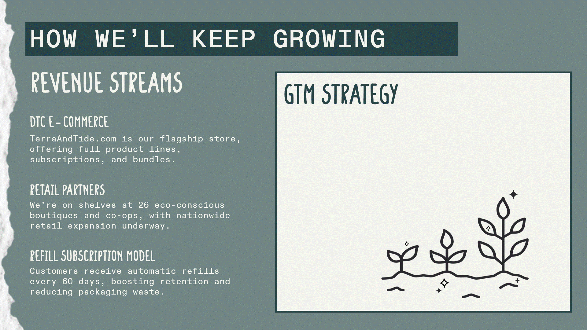
To keep this slide digestible, I split business model and go-to-market strategy into clearly labeled sections. The three-phase roadmap shows growth visually and subtle transitions pace the rollout of info without cluttering the slide.
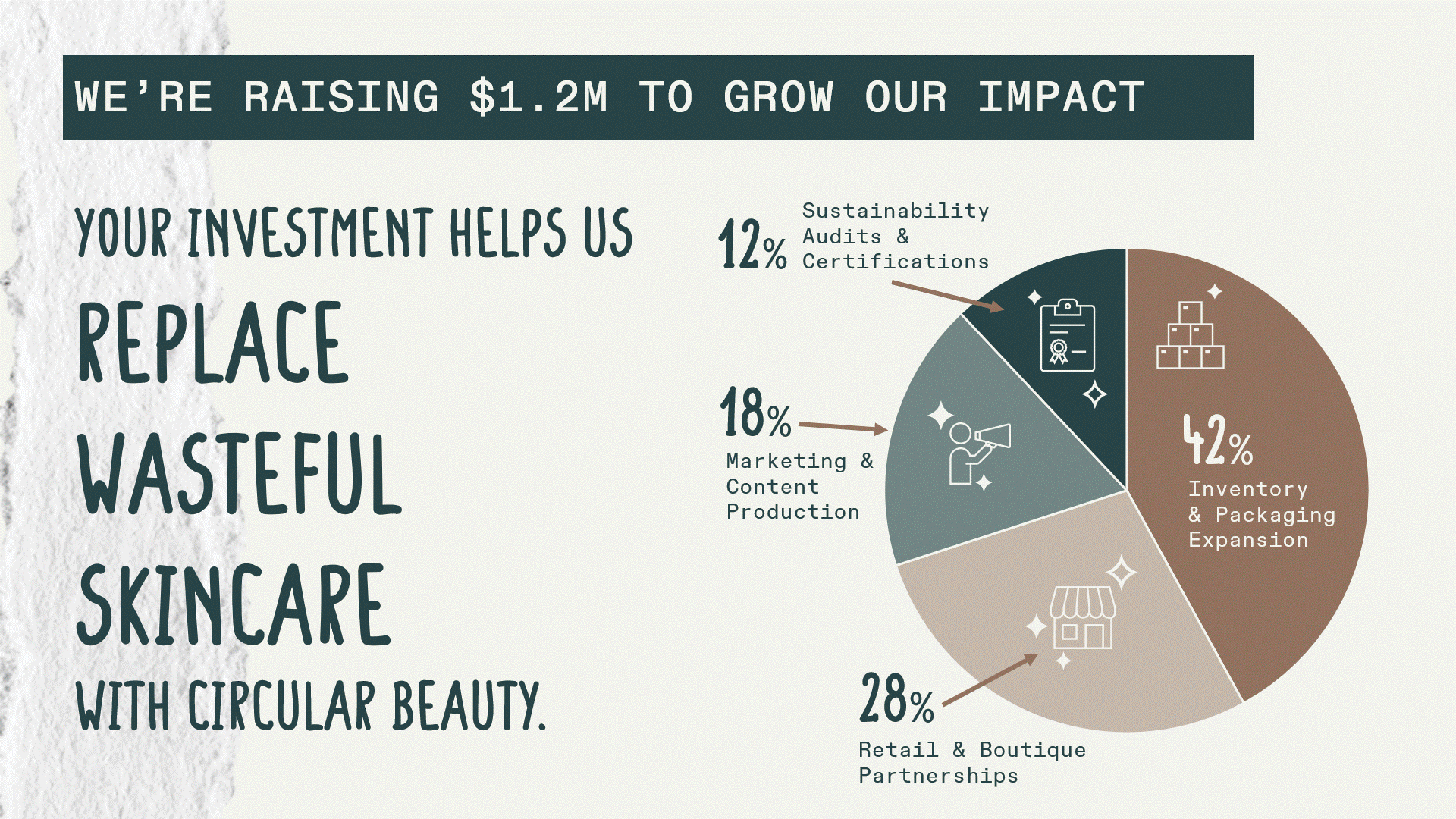
The final funding ask is delivered with simplicity and polish: a clean pie chart, thoughtful layout, and soft CTA line that ties back to the brand’s voice. I used animation to draw attention to how the funds will be allocated. (It only spins once. I blame the GIF.)

This final slide brings the case study full circle. It highlights the three core skills demonstrated throughout the project: narrative structure, data visualization, and animation.